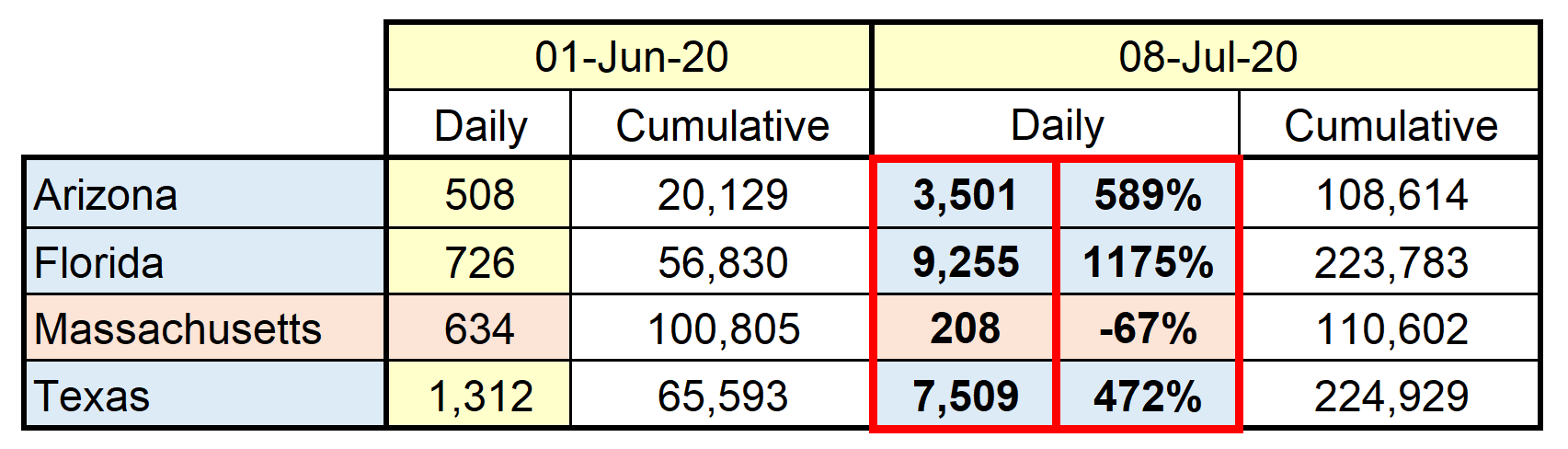
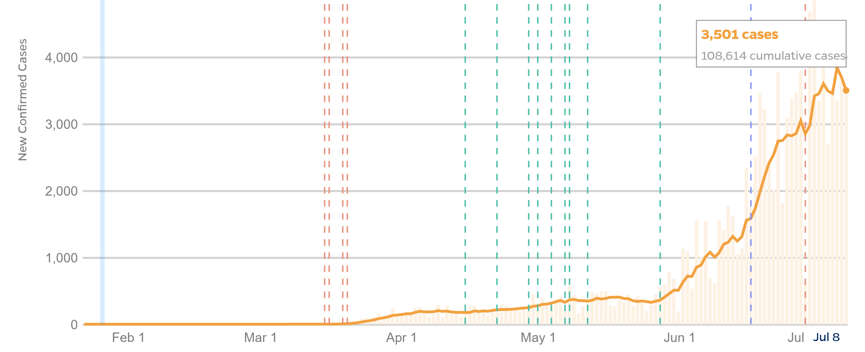
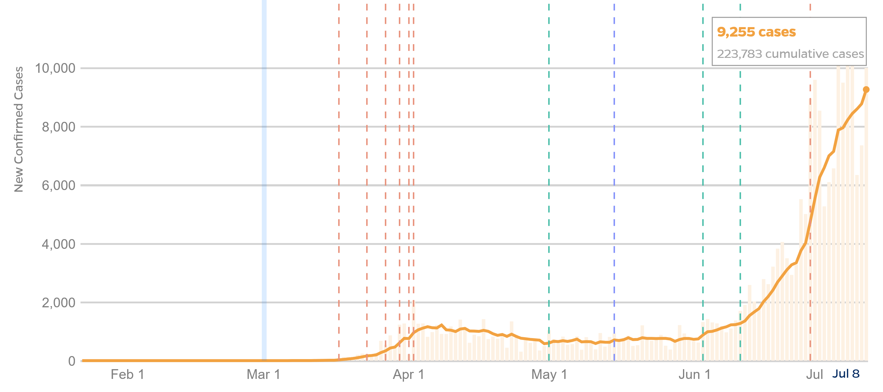
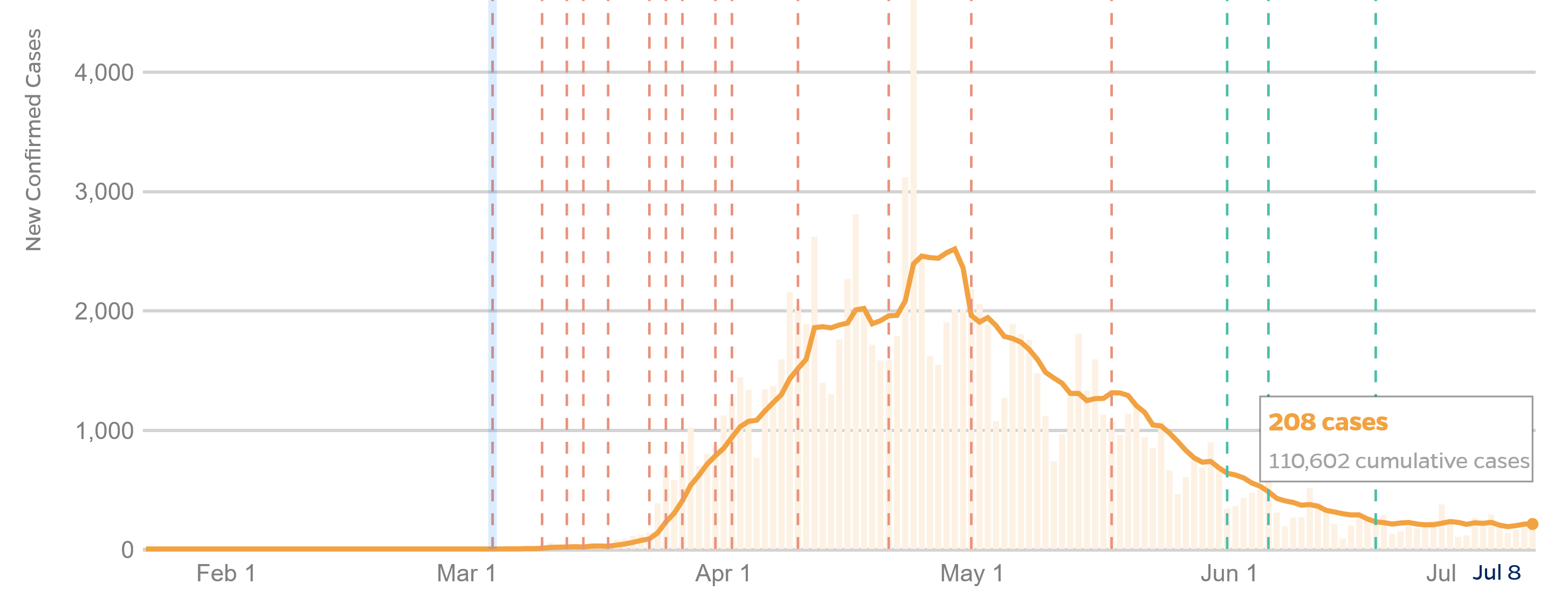
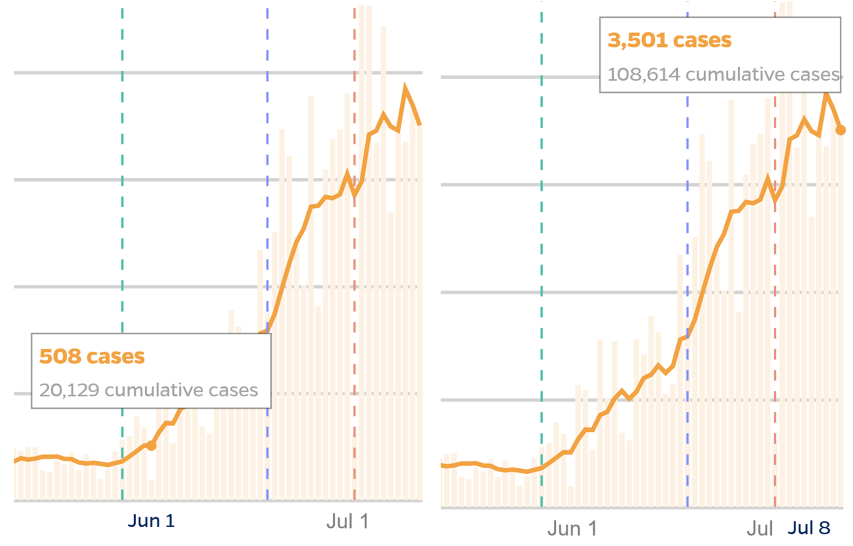
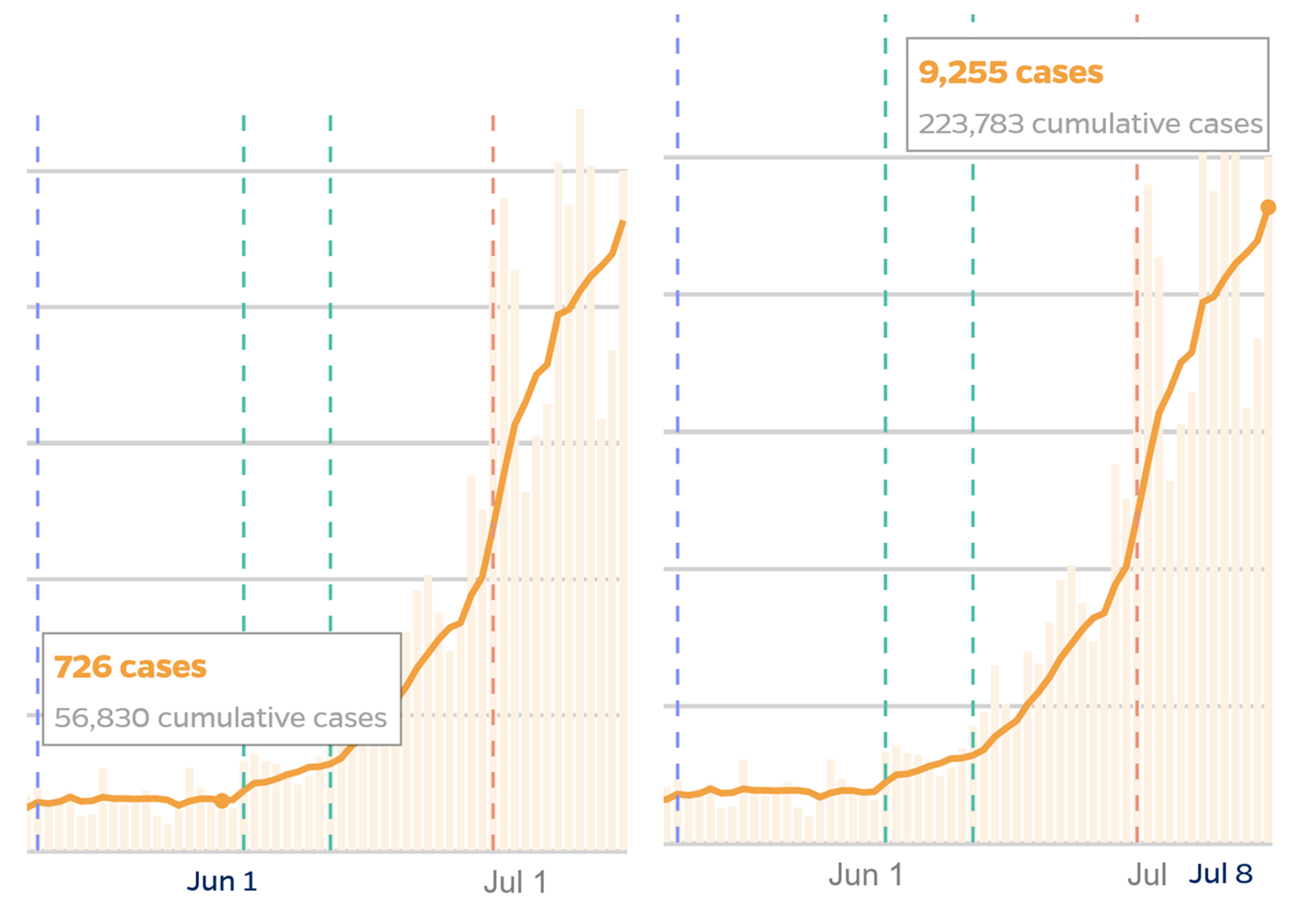
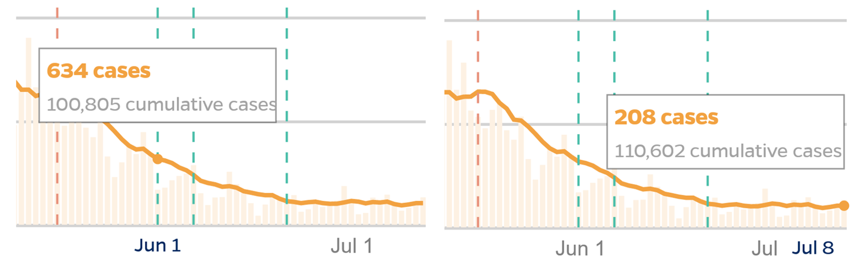
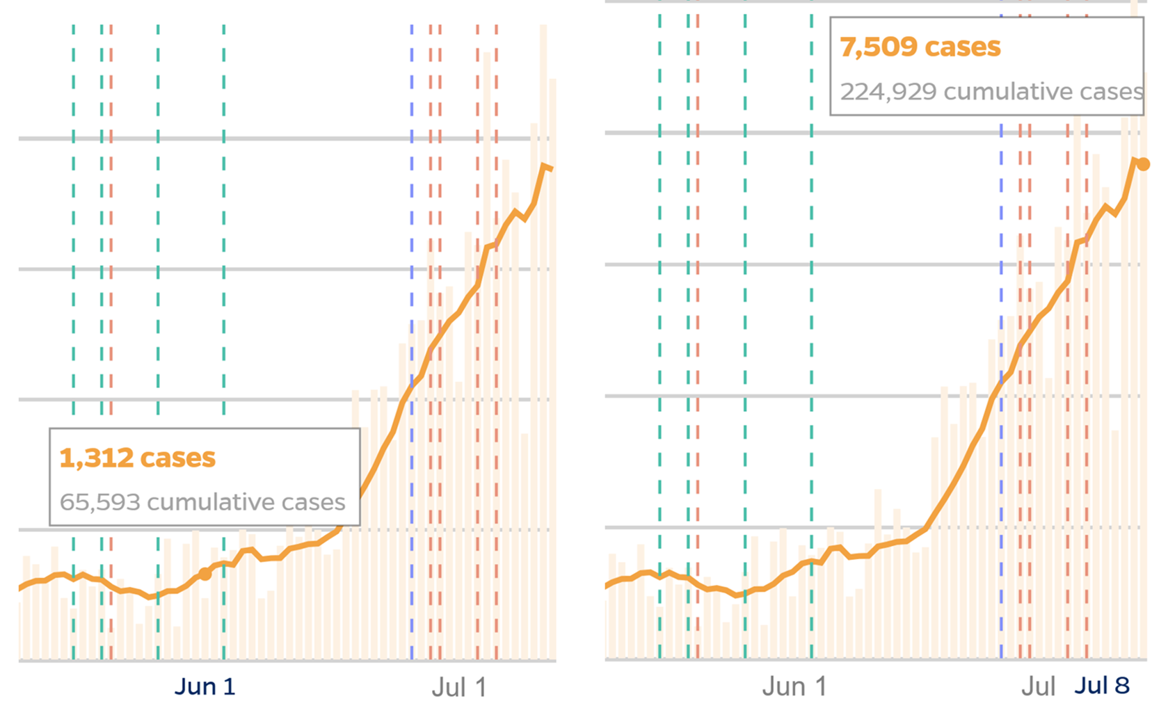
While the spread of COVID-19 in Massachusetts peaked in mid-April, the numbers of new confirmed cases has soared in states that have relaxed precautions in order to reopen their economies. The following charts from the Coronavirus Resource Center, Johns Hopkins University at https://coronavirus.jhu.edu/data/state-timeline display the stark contrast between three such states and Massachusetts with respect to numbers of confirmed cases. The heavy lines plot the 7-day running average of new daily cases of COVID-19, while the faint bars show the new cases reported daily. The numbers for July 8 are displayed in a text box on each chart. The broken vertical lines indicate the dates of public policy landmarks that are identified with legends on the web pages from which these charts were copied.
Arizona
 Florida
 Massachusetts
 Texas
Texas
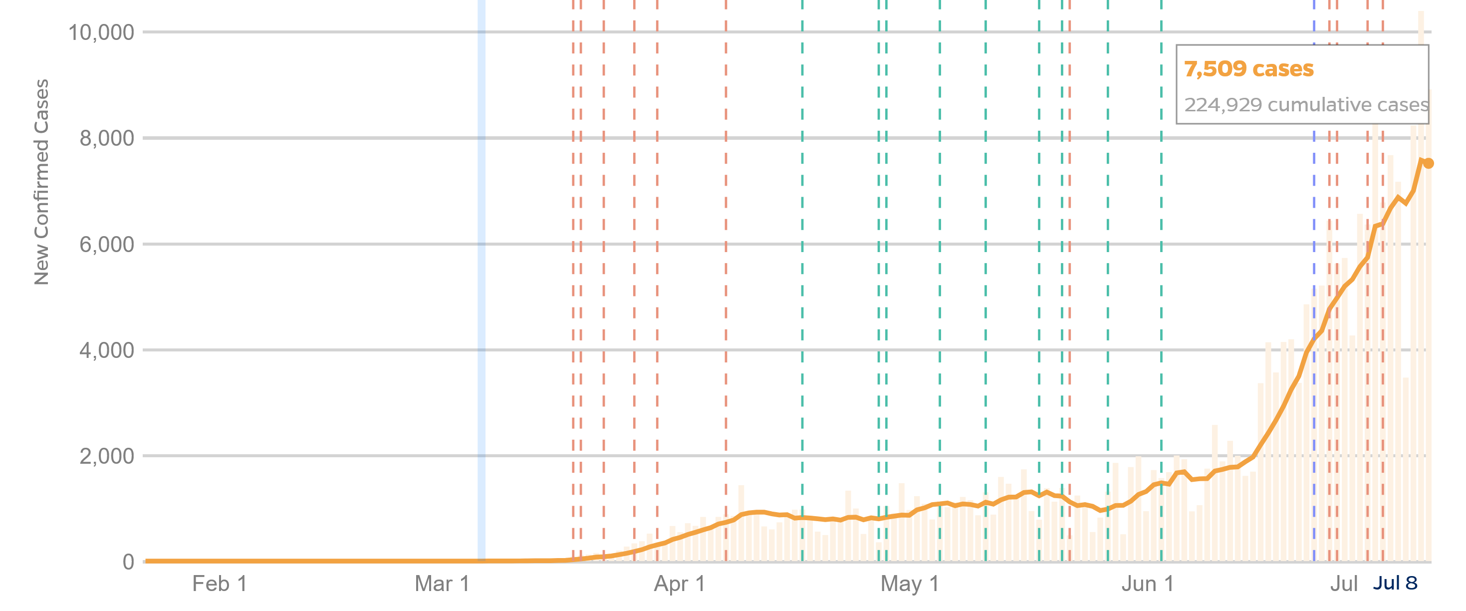
Analysis: Between June 1 and July 8, Arizona’s average daily case count increased 590% to more than 3,500 new confirmed cases per day, Florida’s increased nearly 1,200% to more than 9,200 new cases per day, and Texas’s increased 470% to more than 7,500 new cases per day. Meanwhile, Massachusetts had 208 new cases per day on July 8, which was less than one-third the 634 new cases reported on June 1. The commonwealth’s maximum daily increase in the number of new cases peaked at 3,025 on April 27 and has progressively decreased since then. (See MASSACHUSETTS.) Note: The Johns Hopkins COVID-19 case counts for Massachusetts differ slightly from similar data from the Massachusetts Department of Public Health, which sometimes reports only confirmed cases while at other times includes both confirmed and probable cases in its reports.
Technical Details of the Above Analysis: The above analysis is based on data extracted from the interactive charts published by the Coronavirus Resource Center, Johns Hopkins University at https://coronavirus.jhu.edu/data/state-timeline, The screenshots depicted above were taken with the cursor hovering over the bold line portraying the 7-day moving average case count at July 8. However, the average case counts for other dates can be similarly obtained. Here are snippets of the screenshots for June 1 and July 8 side-by-side showing how the numbers reported in the above analysis were obtained:
Arizona
 Florida
 Massachusetts
 Texas
Texas
The June 1 and July 8 case counts were then entered into a spreadsheet to calculate percentage changes between those two dates: